
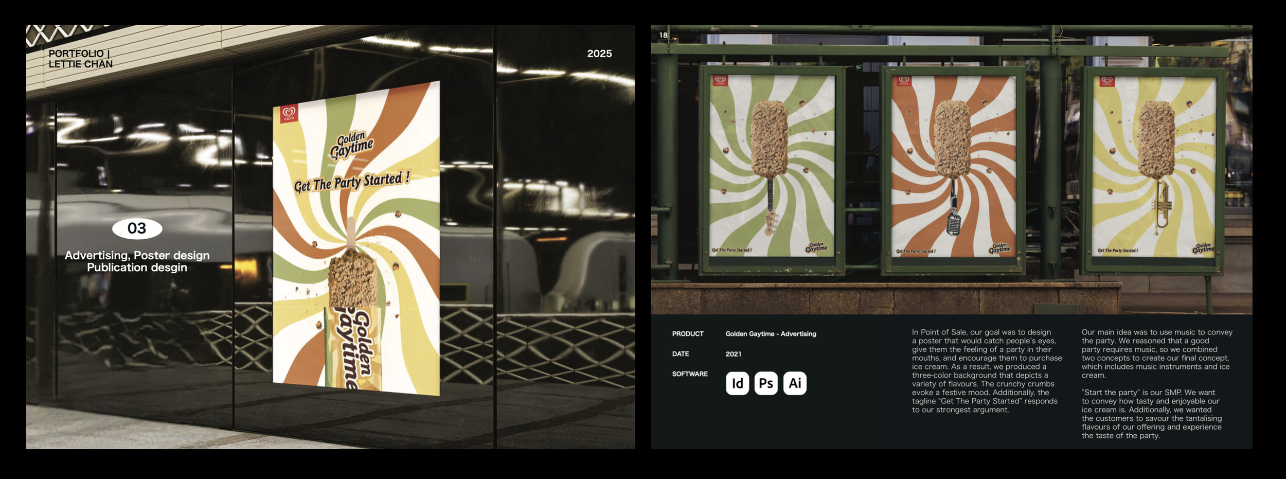
A nostalgic campaign full of bold flavor and cheeky tone — made for summer scrolls.
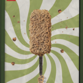
Golden Gaytime Advertising
INTRODUCTION
A playful and energetic campaign concept created for the iconic Australian ice cream brand, Golden Gaytime.
This project explores how bold visuals, cheeky tone, and nostalgic flavor can come together in a fresh advertising direction.
호주 대표 아이스크림 브랜드인 Golden Gaytime을 위한 유쾌한 광고 디자인 컨셉입니다.
대담한 비주얼과 장난기 있는 문구, 그리고 추억의 맛이 어우러진 새로운 캠페인 방향을 제시합니다.
Visual Style: Bright, retro-inspired, collage-like layering
Typography: Bold, playful sans-serifs
Color Palette: Caramel, chocolate, cream, pops of pink and yellow
Mood: Cheeky, nostalgic, high-energy
Tagline direction: Lightly flirty, fun, and memorable

CREATIVE CONCEPT
Inspired by Golden Gaytime’s bold identity and nostalgic pop-culture legacy, the visuals were crafted to feel punchy, playful, and unmistakably local.
Using retro-toned color palettes, quirky type, and layered compositions, the campaign celebrates joy, personality, and fun.
Golden Gaytime 특유의 과감한 정체성과 팝 감성을 기반으로, 톡톡 튀고 개성 넘치는 비주얼을 연출했습니다.
복고풍 색감, 위트 있는 타이포, 레이어드 구성을 활용해 즐거움과 브랜드의 유쾌한 성격을 표현했습니다.
Looking for a visual language that feels like you?
I work with individuals, studios, and brands to shape identities with clarity and feeling.
📩 hello.leform@gmail.com