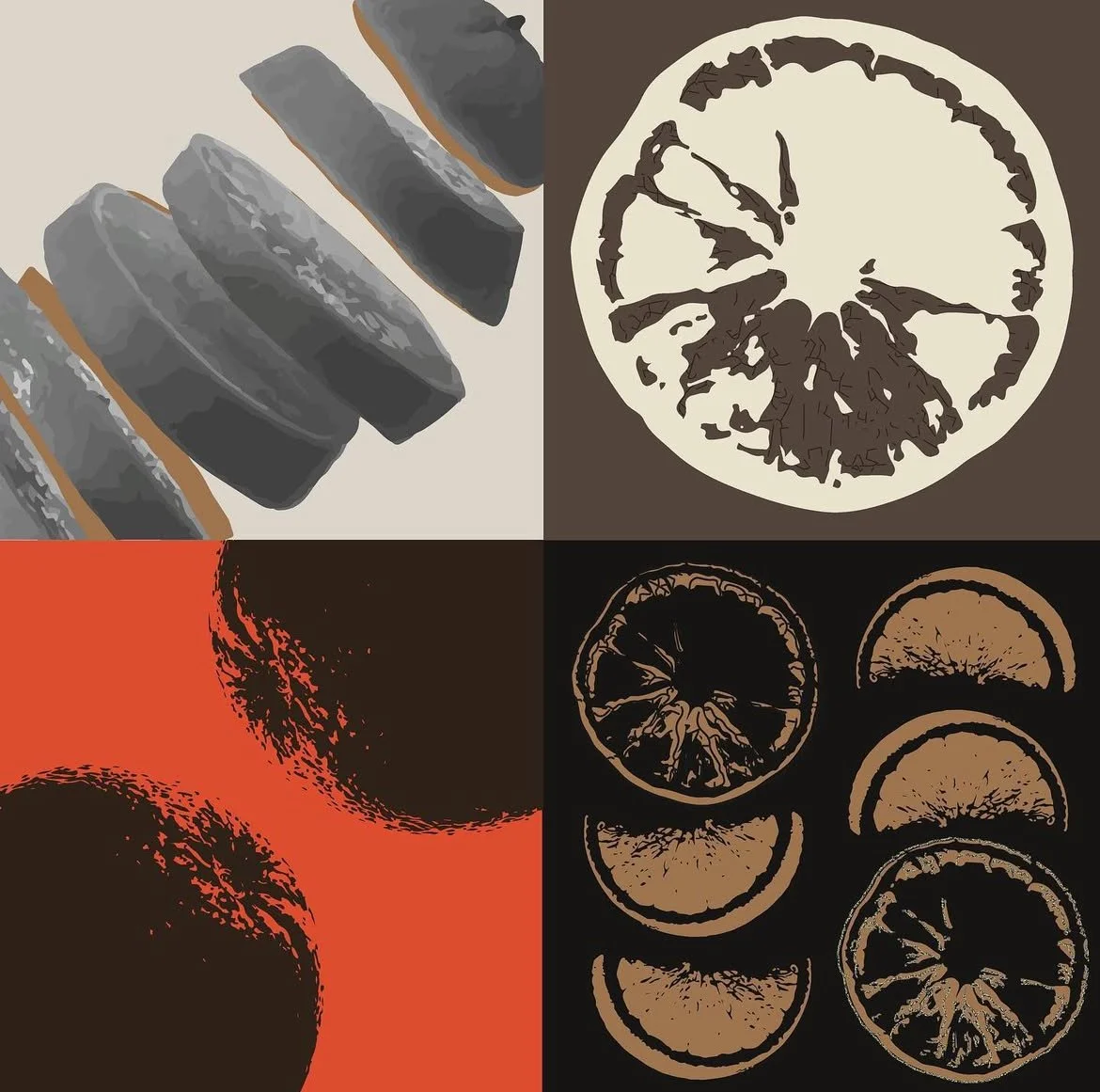
Earthy design for dried orange slices — clean, conscious, and crisp.
SayunSayuna Organics Packaging
Introduce SAYUNA
School Project | 2022
A visual identity and packaging concept for Sayuna Organics, a local retail brand specialising in organic food products.
This project explores how natural textures, clear typography, and soft form language can build trust and calm in a retail environment. Using the existing logo as the foundation, the identity expands into thoughtful packaging and print collateral.
Deliverables
– Product packaging (pouches, boxes, labels)
– Typography & color system
– Print layout design
– Visual direction for shelf presence
Packaging Highlight
-

Creative Direction
The overall tone is quiet, natural, and refined.
Typography is structured yet gentle. Packaging layouts follow a flexible grid system that allows for product expansion while maintaining consistency.
The palette leans into muted botanical tones, grounding the brand in nature and soft functionality. -

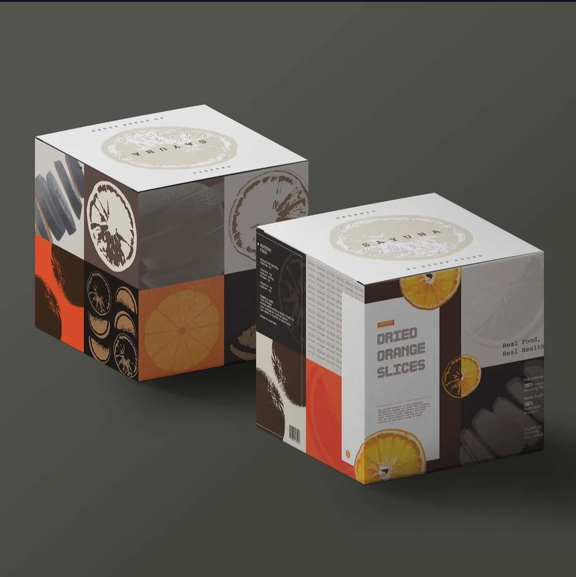
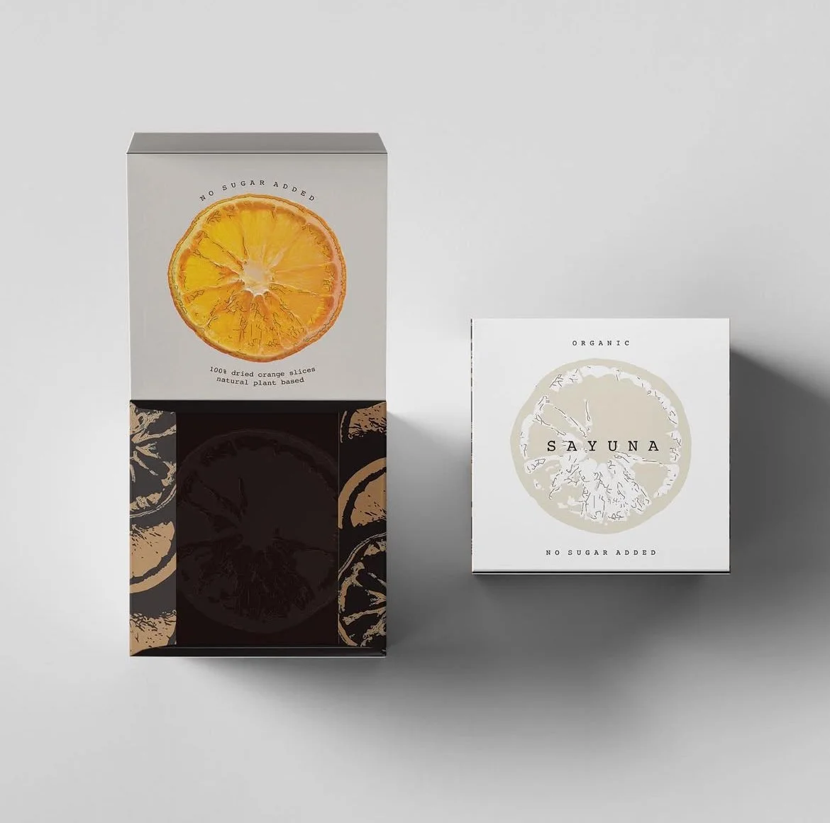
Packaging Highlight — Organic Dried Orange Slice
This package is designed for Sayuna's signature dried orange slices, often used in teas, baking, or as a natural garnish.
The visual treatment balances clarity and warmth — with soft beige tones, rounded type, and a transparent window to showcase the product. The front label provides essential info, while the back label keeps everything clean and aligned with the visual system.
Careful attention was given to material choice and labeling hierarchy — to reflect the brand’s values: organic, minimal, and honest.
-

Project Info
Type
Packaging Design / Visual Identity / Student ProjectYear
2022Role
Concept, Art Direction, Packaging Design, Layout
Have a story to move?
Whether it’s motion, visuals, or a new product launch —
Let’s bring it to life, frame by frame.
💌 hello.leform@gmail.com


